Elements Appearance API
Customize the look and feel of Elements to match the design of your site.
Stripe Elements supports visual customization, which allows you to match the design of your site with the appearance option. The layout of each Element stays consistent, but you can modify colors, fonts, borders, padding, and more.
- Pick a prebuilt theme that most closely resembles your website.
- Customize the theme using inputs and labels. You can also set variables, such as the
fontFamilyandcolorPrimaryto broadly customize components appearing throughout each Element. - If needed, fine-tune individual components and states using rules.
For complete control, specify custom CSS properties for individual components appearing in the Element.
Note
The Elements Appearance API doesn’t support individual payment method Elements (such as CardElement). Use the Style object to customize your Element instead.
Themes
Start customizing Elements by selecting one of the following themes:
stripenightflat
const appearance = {
  theme: 'night'
};

// Pass the appearance object when initializing checkout
const checkout = stripe.initCheckoutElementsSdk({clientSecret, elementsOptions: {appearance}});
Inputs and labels
Customize the appearance of input fields and their associated labels.
const appearance = {
  inputs: 'spaced',
  labels: 'auto'
}
Inputs
Choose the style of input fields to suit your design.
| Variant | Description |
|---|---|
spaced |
Each input field has space surrounding it. This is the default option. |
condensed |
Related input fields are grouped together without space between them. |
Labels
Control the position and visibility of labels associated with input fields.
| Variant | Description |
|---|---|
auto |
Labels adjust based on the input variant. When inputs are spaced, labels are above. When inputs are condensed, labels are floating. This is the default option. |
above |
Labels are positioned above the corresponding input fields. |
floating |
Labels float within the input fields. |
Variables
Set variables to affect the appearance of many components appearing throughout each Checkout element.

The variables option works like CSS variables. You can specify CSS values for each variable and reference other appearance variables with the var(--myVariable) syntax. You can even inspect the resulting DOM using the DOM explorer in your browser.
Note
The colorPrimary, colorBackground, colorText, colorSuccess, colorDanger, and colorWarning variables don’t support rgba() or the var(--myVariable) syntax.
const appearance = {
  theme: 'stripe',

  variables: {
    colorPrimary: '#0570de',
    colorBackground: '#ffffff',
    colorText: '#30313d',
    colorDanger: '#df1b41',
    fontFamily: 'Ideal Sans, system-ui, sans-serif',
    spacingUnit: '2px',
    borderRadius: '4px',
    // See all possible variables below
  }
};

// Pass the appearance object when initializing checkout
const checkout = stripe.initCheckoutElementsSdk({clientSecret, elementsOptions: {appearance}});
Commonly used variables
| Variable | Description |
|---|---|
fontFamily |
The font family used throughout the UI. Elements support custom fonts by passing the fonts option to initCheckoutElementsSdk or CheckoutElementsProvider. |
fontSizeBase |
The font size that’s set on the root of the UI. By default, other font size variables such as fontSizeXs or fontSizeSm are scaled from this value using rem units. Make sure that you choose a font size of at least 16px for input fields on mobile. |
spacingUnit |
The base spacing unit that all other spacing is derived from. Increase or decrease this value to make your layout more or less spacious. |
borderRadius |
The border radius used for tabs, inputs, and other components. |
colorPrimary |
A primary color used throughout the UI. Set this to your primary brand color. |
colorBackground |
The color used for the background of inputs, tabs, and other components. |
colorText |
The default text color used. |
colorDanger |
A color used to indicate errors or destructive actions. |
Less commonly used variables
Rules
The rules option is a map of CSS-like selectors to CSS properties, allowing more customization of individual components. After defining your theme and variables, use rules to integrate the UI to match the design of your site.
const appearance = {
    rules: {
      '.Tab': {
        border: '1px solid #E0E6EB',
        boxShadow: '0px 1px 1px rgba(0, 0, 0, 0.03), 0px 3px 6px rgba(18, 42, 66, 0.02)',
      },

      '.Tab:hover': {
        color: 'var(--colorText)',
      },

      '.Tab--selected': {
        borderColor: '#E0E6EB',
        boxShadow: '0px 1px 1px rgba(0, 0, 0, 0.03), 0px 3px 6px rgba(18, 42, 66, 0.02), 0 0 0 2px var(--colorPrimary)',
      },

      '.Input--invalid': {
        boxShadow: '0 1px 1px 0 rgba(0, 0, 0, 0.07), 0 0 0 2px var(--colorDanger)',
      },

      // See all supported class names and selector syntax below
    }
  };

// Pass the appearance object when initializing checkout
const checkout = stripe.initCheckoutElementsSdk({clientSecret, elementsOptions: {appearance}});
All rules
The selector for a rule can target any of the public class names in the UI, and the supported states, pseudo-classes, and pseudo-elements for each class. For example, the following are valid selectors:
.Tab, . Label, . Input .Tab:focus .Input--invalid, . Label--invalid .Input::placeholder
The following are not valid selectors:
-
., only public class names can be targetedp-SomePrivateClass, img -
., ancestor-descendant relationships in selectors are unsupportedTab . TabLabel -
., theTab--invalid .class doesn’t support theTab --invalidstate
Each class name used in a selector supports an allowlist of CSS properties, that you specify using camel case (for example, boxShadow for the box-shadow property).
The following is the complete list of supported class names and corresponding states, pseudo-classes, and pseudo-elements.
Tabs
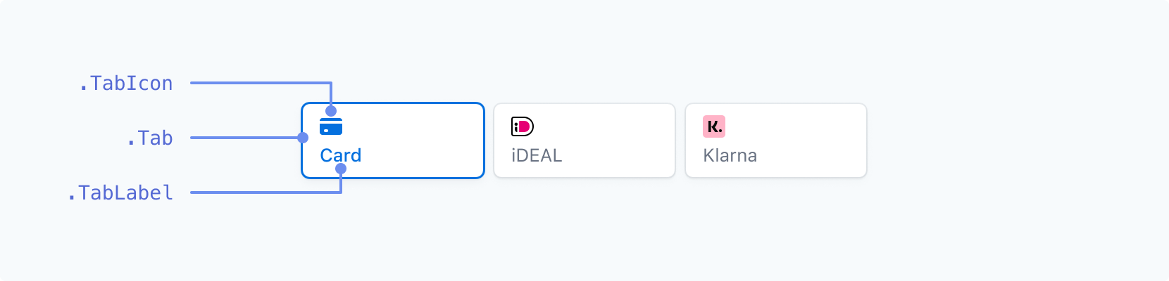
| Class name | States | Pseudo-classes | Pseudo-elements |
|---|---|---|---|
. |
--selected |
:hover, :focus, :active, :disabled
|
|
. |
--selected |
:hover, :focus, :active, :disabled
|
|
. |
--selected |
:hover, :focus, :active, :disabled
|
Inputs (above labels)
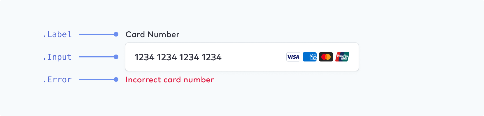
Make sure that you choose a font size of at least 16px for input fields on mobile.
| Class name | States | Pseudo-classes | Pseudo-elements |
|---|---|---|---|
. |
--empty, --invalid, --focused
|
||
. |
--empty, --invalid
|
:hover, :focus, :disabled, :autofill
|
::placeholder, ::selection
|
. |
Inputs (floating labels)
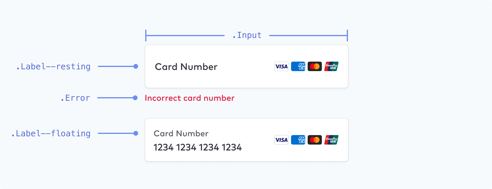
Note
You can enable floating labels as an additional configuration option.
| Class name | States | Pseudo-classes | Pseudo-elements |
|---|---|---|---|
. |
--empty, --invalid, --focused, --floating, --resting
|
||
. |
--empty, --invalid
|
:hover, :focus, :disabled, :autofill
|
::placeholder, ::selection
|
. |
Block
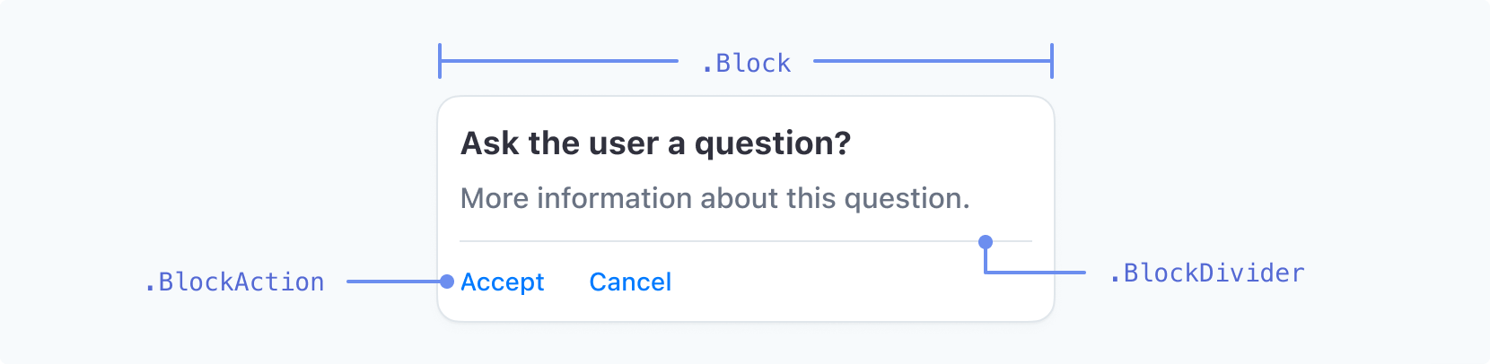
| Class name | States | Pseudo-classes | Pseudo-elements |
|---|---|---|---|
. |
|||
. |
|||
. |
--negative |
:hover, :focus, :active
|
Code Input
| Class name | States | Pseudo-classes | Pseudo-elements |
|---|---|---|---|
. |
:hover, :focus, :disabled
|
Checkbox
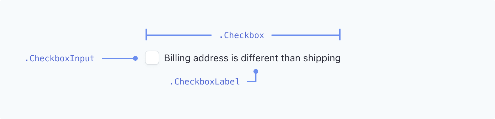
| Class name | States | Pseudo-classes | Pseudo-elements |
|---|---|---|---|
. |
--checked |
||
. |
--checked |
:hover, :focus, :focus-visible
|
|
. |
--checked |
:hover, :focus, :focus-visible
|
Dropdown
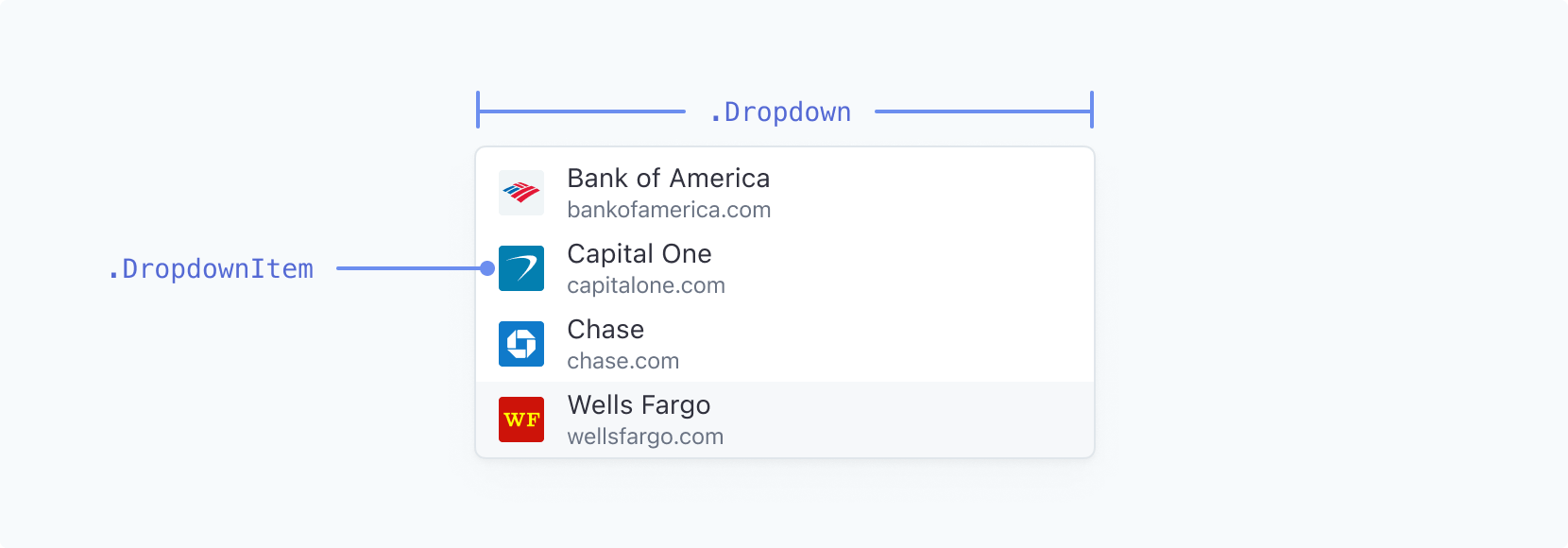
| Class name | States | Pseudo-classes | Pseudo-elements |
|---|---|---|---|
. |
|||
. |
--highlight |
:active |
Note
Dropdown styling is limited on macOS. The appearance API for dropdowns primarily affects Windows systems. On macOS, you can’t style system dropdowns, such as the country selector, using these rules because of operating system restrictions.
Switch

| Class name | States | Pseudo-classes | Pseudo-elements |
|---|---|---|---|
. |
--active |
:hover |
|
. |
:hover |
Picker
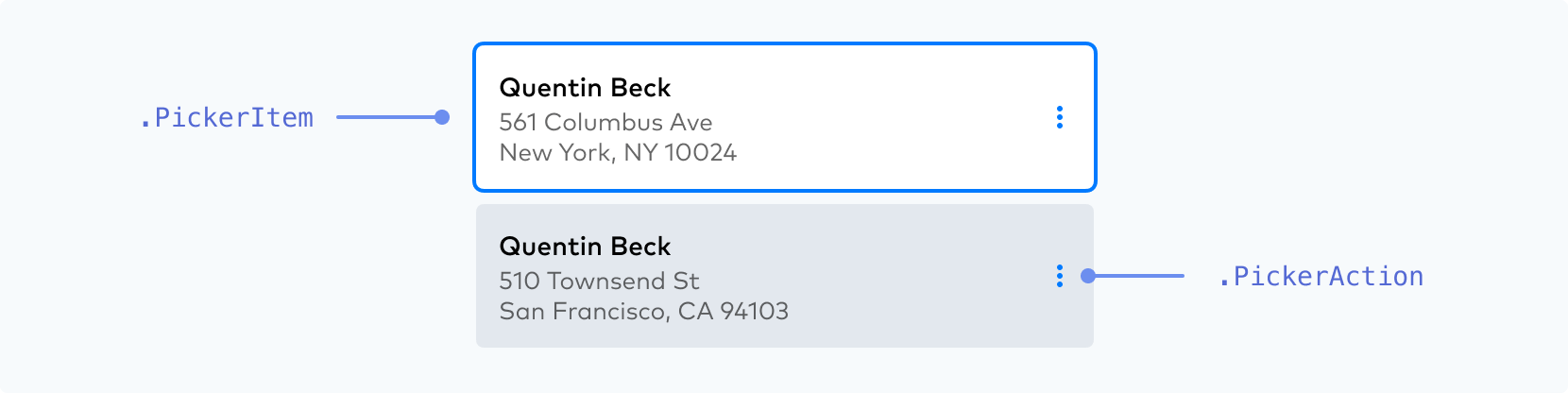
| Class name | States | Pseudo-classes | Pseudo-elements |
|---|---|---|---|
. |
--selected, --highlight, --new, --disabled
|
:hover, :focus, :active
|
|
. |
:hover, :focus, :active
|
Make sure your . active state stands out from the other states.
 |
 |
|
DO Use a noticeable, high-contrast primary color, weight, and/or outline to distinguish the active state your customer has already selected. |
DON’T Don’t use two equally weighted options or low-contrast colors for your .PickerItem states because it makes distinguishing which one is active more difficult. |
Menu
| Class name | States | Pseudo-classes | Pseudo-elements |
|---|---|---|---|
. |
|||
. |
--open |
:hover |
|
. |
--negative |
:hover, :focus, :active
|
Accordion
| Class name | States | Pseudo-classes | Pseudo-elements |
|---|---|---|---|
. |
--selected |
:hover, :focus-visible
|
Payment Method Messaging Element
| Class name | States | Pseudo-classes | Pseudo-elements |
|---|---|---|---|
. |
Radio Icon

| Class name | States | Pseudo-classes | Pseudo-elements |
|---|---|---|---|
. |
|||
. |
--checked, --hovered
|
||
. |
--checked, --hovered
|
You can control the overall size of the icon with the width property on .. You can control the relative size of . with the r (radius) property. . and . are SVG elements and can be styled with stroke and fill properties. See the full list of supported CSS properties below.
const appearance = {
  rules: {
    '.RadioIcon': {
      width: '24px'
    },
    '.RadioIconOuter': {
      stroke: '#E0E6EB'
    },
    '.RadioIconInner': {
      r: '16'
    }
  }
};
Toggle

| Class name | States | Pseudo-classes | Pseudo-elements |
|---|---|---|---|
. |
--selected |
:active, :hover, :focus, :disabled
|
Supported CSS properties
Other configuration options
In addition to themes, labels, inputs, variables and rules, you can style Elements using other appearance configuration options.
You can customize these by adding them to the appearance object:
const appearance = {
  disableAnimations: true,

  // other configurations such as `theme`, `labels`, `inputs`, `variables` and `rules`...
}
We currently support the below options:
| Configuration | Description |
|---|---|
disableAnimations |
Disables animations throughout the UI. Boolean, defaults to false. |